
I can spend hours or even days looking at these types of charts:

Average temperatures in South Central Wisconsin for Spring, varied by year? Hell yes!
Or how about this one?

Severe weather events! Kudos to Washburn, Douglas, Ashland, and Taylor Counties, everyone. Well done.
And not to be limiting, they have links to weather information from the world.
And, after a while, you may finally stumble upon something you don't fully understand, as I did:
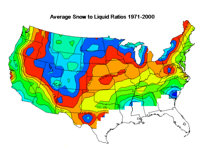
I suppose I understand it, just not exactly the purpose of creating a detailed map of the snow to liquid ratio for the Continental U.S. What the heck, though. There's art for art's sake; why not science for science's sake?
Looking at these things gives me the same kind of feeling I used to get from walking around stationery stores and smelling the rubber stamps. I cannot explain the reason why. It is a good feeling.
How long is spring in Wisconsin?
ReplyDeleteWhat do you mean? Look at the chart. It's 123 years.
ReplyDeleteSorry. 117 years. I'm agnostic.
ReplyDelete